Color Psychology: The Best Paint Colors for a Restful Bedroom
You invest in a premium mattress, blackout curtains, and high-thread-count sheets—but if you are still tossing and turning at night, the culprit might be right in front of you.
The color of your bedroom walls plays a massive, scientifically proven role in your sleep quality. According to color psychology, the hues we surround ourselves with send direct signals to our nervous system. The right color can lower your heart rate and ease you into a deep sleep, while the wrong color can leave your brain buzzing long past midnight.
If you are ready to turn your bedroom into the ultimate sanctuary, here is the science behind the best (and worst) paint colors for rest.
The Science of Seeing Color
When light hits a painted wall, it bounces off and enters your eyes, sending messages to the hypothalamus—the part of the brain that governs your sleep-wake cycles, heart rate, and body temperature.
Cool-toned colors (which have shorter wavelengths) signal the brain to slow down and relax. Conversely, warm, highly saturated colors (with longer wavelengths) signal the brain to wake up and pay attention.
The Best Colors for a Restful Bedroom
If deep sleep is your goal, stick to the cooler side of the color wheel. These shades mimic the calming elements of the natural world.
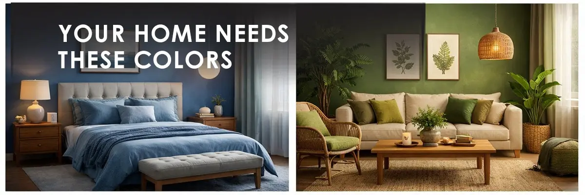
1. Soft, Muted Blues: The Ultimate Sleep Inducer
Blue is universally recognized by interior designers and sleep scientists as the best color for a bedroom. It brings to mind clear, expansive skies and calm bodies of water.
- The Science: Exposure to soft blues has been shown to physically lower blood pressure, slow down respiration, and reduce heart rates.
- Top Picks: Slate blue, dusty blue, soft periwinkle, or a pale icy blue.
2. Sage Green: Nature’s Stress Reliever
Green rests perfectly at the center of the visible color spectrum. This means our eyes require absolutely no adjustment to perceive it, making it the most restful color for the human eye.
- The Science: A soft, earthy green brings the tranquility of the outdoors inside, promoting a feeling of safety, balance, and harmony. It tells the nervous system that it is safe to power down.
- Top Picks: Muted sage, dusty olive, or a soft mint gray.
3. Muted Lavender: The Sophisticated Soother
While bright purple is highly stimulating, a soft, gray-toned lavender has the exact opposite effect. It carries the cooling, calming properties of blue, but with a touch of warmth that keeps the room from feeling too icy.
- The Science: Lavender is associated with relaxation and stress relief (much like the plant itself). It creates a serene, deeply comforting environment.
- Top Picks: Heather gray, dusty lilac, or pale mauve.
The Colors to Keep Out of the Bedroom
Not all colors belong in a sleeping space. While these colors are beautiful, they are better suited for active spaces like kitchens, gyms, or dining rooms.
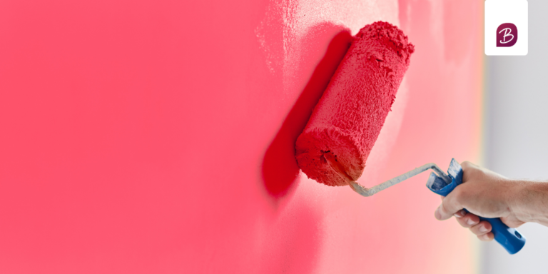
1. Bright Reds and Oranges
Red is the color of danger, passion, and high energy.
- The Science: Red has the longest wavelength on the color spectrum. Studies show that being in a red room can physically increase your heart rate and trigger a mild fight-or-flight response. It is highly stimulating and will make winding down incredibly difficult.
2. Vibrant Yellows
Yellow is the color of sunshine and optimism, but it is far too energetic for a bedroom.
- The Science: Bright yellow mimics bright daylight, which can suppress your body’s natural melatonin production. It strains the eyes and keeps the brain engaged. If you must use yellow, opt for a very muted, pale buttercup shade—but generally, it’s best left for the hallway or kitchen.
3. Stark, Pure White
While a white bedroom looks great on a Pinterest board, pure, blinding white can feel clinical, sterile, and harsh. Under artificial bedside lighting, stark white walls can create a glaring effect that tires the eyes without relaxing the mind.
A Final Tip: Finish Matters
Even if you pick the perfect, calming sage green, the wrong paint finish can ruin the vibe. Always choose a Flat or Matte finish for bedroom walls. Glossy finishes reflect light, creating glares from lamps and streetlights that distract the eye. A flat finish absorbs light, wrapping the room in a soft, velvety texture that practically begs you to go to sleep.
Transforming your sleep habits often starts with a single can of paint. Explore the rest of Coloursbazaar for more tips on choosing the perfect shade, and get ready for the best night’s sleep you’ve ever had!