Why Your Paint Looks Different on the Wall: Understanding Light and Undertones
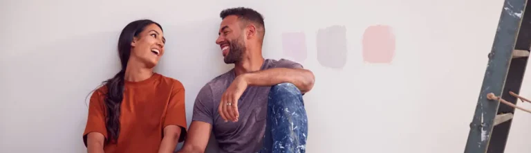
We have all experienced this incredibly frustrating scenario: You spend hours in the hardware store agonizing over paint swatches. You finally pick the perfect, cozy “greige” (gray-beige). But when you roll it onto your living room wall and step back, it doesn’t look cozy at all—it looks purple!
Why does this happen? Did the paint store mix the wrong color?
Probably not. The real culprit comes down to the two most misunderstood aspects of interior design: Lighting and Undertones. Here is your masterclass on why paint colors shapeshift, and how to make sure you get it right the first time.
1. The Direction of Natural Light
The light in the hardware store is completely different from the light in your home. Store lighting is usually a mix of bright, cool fluorescents. But in your home, the direction your windows face dictates the “temperature” of your light.
North-Facing Rooms (Cool Light) Northern light is indirect, cool, and casts a slightly bluish tint across the room.
- The Effect: It tends to wash out warm colors and make cool colors (like gray or blue) look even icier.
- The Solution: If you have a north-facing room, you need to overcompensate with warmth. Choose creamy whites, warm beiges, or colors with slight yellow or red bases to balance the chill.
South-Facing Rooms (Warm Light) Southern light is direct, golden, and warm. It is the easiest light to work with because it makes almost everything look good.
- The Effect: It intensifies warm colors (a subtle yellow can quickly turn neon in southern light) and balances out cool colors.
- The Solution: You can use cooler grays, moody blues, and stark whites here. The warm sun will naturally soften them.
East and West-Facing Rooms (Changing Light) These rooms are tricky because the light changes drastically. East-facing rooms are bright and warm in the morning, but shadowy and cool in the afternoon. West-facing rooms are dull in the morning, but bathed in intense orange/red light at sunset.
- The Solution: Test your paint samples in the room at the time of day you use the room the most!
2. The Secret World of Undertones
Every can of paint is made by mixing multiple different pigments together. The color you immediately see is called the Mass Tone (e.g., “Oh, that’s gray”). But underneath the mass tone is the Undertone (e.g., “Wait, it’s a gray made with a drop of magenta”).
The “Gray Trap” is the most common mistake DIYers make. Grays almost always have one of three undertones:
- Blue/Cyan: Makes the room feel cool and modern.
- Green: Makes the room feel earthy and calm.
- Purple/Magenta: This is the one that surprises people! A purple-undertone gray will suddenly look like a soft lavender under the wrong lighting.
How to Spot the Hidden Undertone
Before you buy a gallon of paint, take the paper swatch and place it directly against a sheet of pure, bright white printer paper. By contrasting the paint against true white, the hidden undertone will instantly reveal itself.
3. Artificial Lighting Matters Too
Don’t forget about your lightbulbs!
- Warm White LEDs / Incandescents (2700K – 3000K): Cast a yellow/amber glow. They make reds, oranges, and yellows look richer, but can make blues look greenish.
- Cool White / Daylight Bulbs (4000K – 5000K): Cast a stark, bluish-white light. Great for modern spaces, but can make warm colors feel harsh and sterile.