If the last few years were all about playing it safe with cool grays and stark, minimalist whites, 2026 is the year we finally invite personality back into our homes.
This year’s color palettes are all about creating spaces that feel lived-in, comforting, and deeply personal. We are seeing a massive shift toward nature-inspired hues, rich dramatic tones, and a completely new way of applying paint to our walls.
Whether you are planning a full home renovation or just want to refresh a tired guest bedroom, here are the top paint color trends dominating 2026—and exactly how you can bring them to life in your own space.
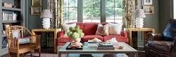
1. The Return of Warmth: Terracotta and Baked Clay
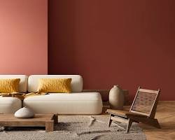
Say goodbye to sterile, icy tones. The biggest neutral trend of 2026 is a heavy lean into earthy, sun-baked warmth. We are seeing beautiful shades of terracotta, soft peach, and muddy blush taking over living rooms and kitchens.
- Why we love it: These colors mimic the natural earth, instantly making a room feel grounded, welcoming, and cozy. They also look incredible when paired with natural wood furniture, linen fabrics, and indoor plants.
- Where to use it: Living rooms, entryways, and dining spaces. It’s also a fantastic choice for a bohemian or Mediterranean-inspired bedroom.
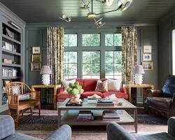
2. Moody & Dramatic: The “Dark Academia” Influence
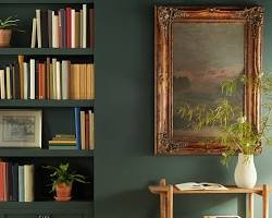
On the opposite end of the spectrum from soft neutrals are the deep, moody jewel tones. Rich forest greens, deep plum, charcoal, and true navy blue are having a massive moment. Instead of making a room feel smaller, these colors blur the edges of a space, making it feel infinite and incredibly luxurious.
- Why we love it: It adds instant architectural interest and sophistication to a builder-grade room without needing to buy expensive furniture.
- Where to use it: Powder rooms, home offices, and dining rooms. If you want a cozy, cave-like feel, these tones are also stunning in a primary bedroom.
3. Botanical Greens: Bringing the Outside In
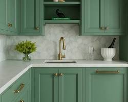
If there is one specific color family defining this decade, it is green. In 2026, we are moving away from bright emeralds and settling into muted, complex greens like soft sage, olive, and dusty eucalyptus.
- Why we love it: Green acts as a bridge between a neutral and a color. It is highly versatile, calming to the nervous system, and pairs beautifully with brass hardware and warm wood floors.
- Where to use it: Kitchen cabinets! A sage green kitchen with brass hardware is one of the most highly sought-after looks right now. It is also perfect for bathrooms and sunrooms.
4. Buttery Yellows: A Splash of Optimism
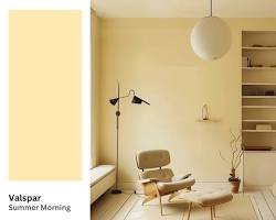
Yellow can be an intimidating color to paint with, but the 2026 version of yellow is not neon or overwhelming. Think of the soft, buttery color of morning sunlight, or a muted, earthy mustard.
- Why we love it: It brings an undeniable sense of optimism and joy into the home. It is a mood-boosting color that makes spaces feel larger and brighter.
- Where to use it: Rooms that lack natural light. A soft, creamy yellow can completely transform a dark hallway, a laundry room, or a north-facing bedroom.
5. The Application Trend: “Color Drenching”
In 2026, the trend isn’t just what color you paint, but how you paint it. The era of the single “accent wall” is fading. Instead, designers are embracing Color Drenching. This involves painting the walls, the baseboards, the window trim, the doors, and sometimes even the ceiling all in the exact same color.
- Why we love it: It creates a seamless, highly custom look. By removing the harsh visual break of white trim against a colored wall, the room actually feels taller and more cohesive.
- How to pull it off: If you are nervous about drenching a room in a bold color, try it with a mid-tone green or a warm beige. Use a flat or eggshell finish on the walls and a satin finish on the trim in the exact same shade for a subtle, elegant contrast.
A Quick Tip Before You Paint
Lighting changes everything! A color that looks perfectly warm in a brightly lit store might look muddy and dark in your north-facing living room. Always buy a small sample pot, paint a large square on a piece of cardboard, and move it around your room at different times of the day before committing to gallons of paint.
Which 2026 paint trend is your favorite? Are you Team Moody Dark or Team Warm Terracotta? Let us know in the comments below, and don’t forget to explore the rest of Coloursbazaar for more DIY painting tips and inspiration!
Leave a Comment